Here is a list of the films I looked at and what I will take from them:
Zombieland
The idea I will take away from this film will be the idea of the titles interacting with the action on screen this makes the titles far more interesting and entertaining than just static or uninvolved text.
Machete
One of the things I will take away from Machete was the use of a very cool production icon that was entertaining in itself, another thing I will take away from this film was its use of colour and contrasting colours with each image being largely one solidly colour- mainly red
Dinner for schmucks
One thing I'll take away from the opening sequence of Dinner for schmucks is the way it's text is mainly very small and unobtrusive and so doesn't take away from what's happening on screen but compliments it instead, I'd like for the main titles of our film- except for the films title itself, to be largely done this way so that it doesn't detract from whats happening on screen. Also I' quite like it if the titles faded in and out like the ones in this film.
Total Recall
I don't know if there's much I'm going to take away form these titles except perhaps it's powerful use of music, due to it's music despite nothing much is really happening on screen the audience doesn't grow too bored, also it has very bold text which I like as well.
Napoleon Dynamite
One thing I liked about this title sequence was how it used a montage of clips in ever increasing speed coupled with gentle and pleasing music. also I like the way it used various mediums to show it's titles I'm not sure how much of these techniques we will sue in our opening sequence titles but I did enjoy it.
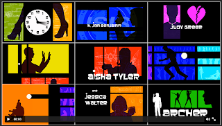
Archer
One thing I particularly like about the Archer title sequence is how it is a mock James Bond opening sequence and I wish we could have an animation sequence like this in our film opening but sadly it would be too difficult and time consuming so we can't but maybe we'll be able to fit something like this in in some other way.
Overall I think looking at all these title sequences and focusing on the typography has been a great help to me in planning our own title sequences as though our group did have some plans for what we wanted to do I now have many more ideas and a better in depth knowledge of what ours should look like.


No comments:
Post a Comment